Lake Wampanoag, Gardner
The third sanctuary I visited for this project, back on May 4, 2015, was Lake Wampanoag in Gardner. (see A Taste of the North, May 4, 2015). That day, I found some striking pileated woodpecker excavations in a red spruce tree. I found the holes in the usual way – woods chips scattered across the trail caused me to stop and look up. The holes were very fresh. The heartwood glowed a bright orangey-tan, outlined by the rich burnt sienna of the inner bark.
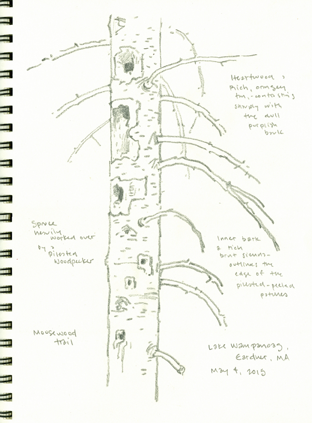
sketchbook page, 9″ x 12″
I made this pencil drawing at the time, and took some color notes. As usual in cases like this, I never saw the bird. However, pileated woodpeckers are common around my home in Princeton and I’ve had many opportunities to observe and sketch them in the past.
Weeks passed, then months. But the spruce trunk and those woodpecker holes stuck in my mind, and I finally got around to developing them into something more…
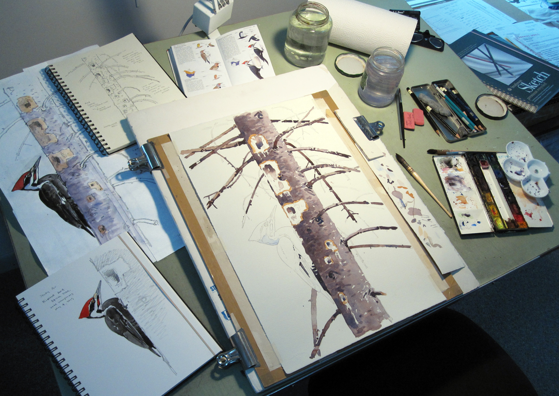
the work in progress…
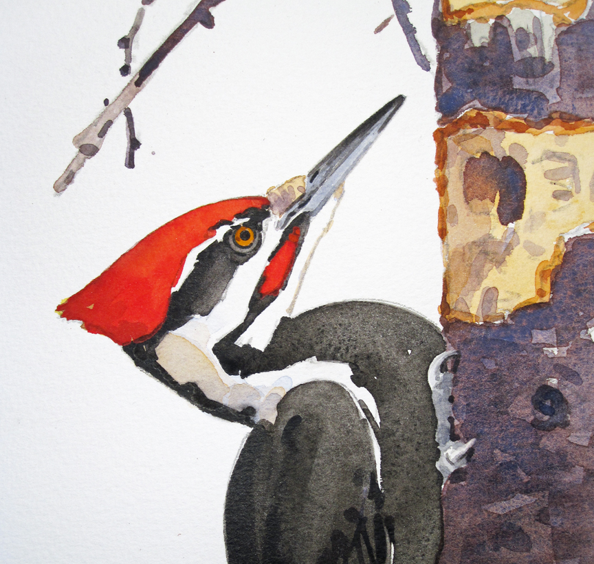
In the studio, I worked up some sketches of a male pileated to “fit” with the spruce trunk, taking care to adjust the viewpoint, scale, pose and balance. Working at a large size is much easier in the studio than in the field, so I scaled things up here. At 22.5″ x 14″, this is the largest watercolor I’ve done for the residency so far. The composition I developed is as much a portrait of the holes as it is of the bird, and I liked this idea of a dual center of interest, with both carrying equal weight. After all, you couldn’t have one without the other!
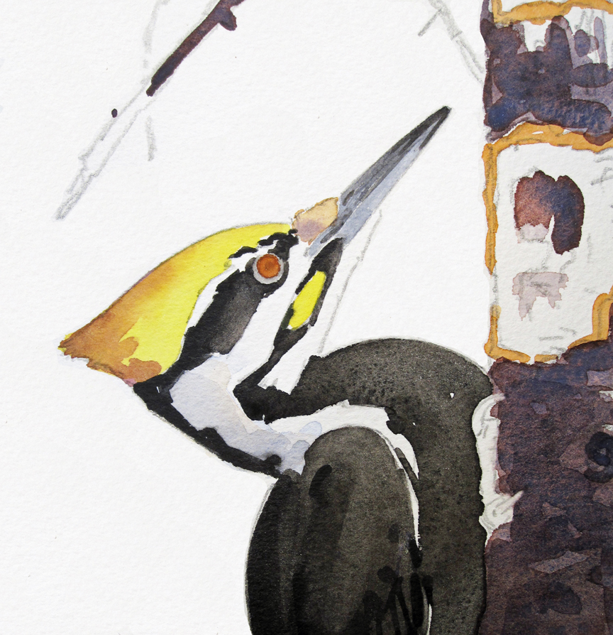
When I want a red note in a watercolor to really POP, I almost always start with an under layer of pure lemon yellow. I allow this to dry completely, and then glaze over it with a strong wash of cadmium red.
The yellow under layer gives the red a glowing quality that it would not possess by itself.
I originally intended to add a full background to this painting – or at least a background tone. But as the work progressed, I realized that I didn’t need a background of any kind, and that the bird and tree trunk alone made a stronger statement. The spruce tree here acts as a surrogate for the environment – representing those unusual, cool spruce woods at Wampanoag.
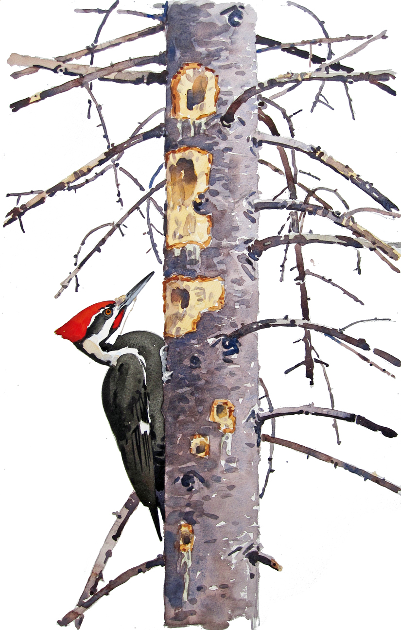
Pileated Woodpecker and Red Spruce, watercolor on Winsor & Newton cold-press, 22.5″ x 14″
Another reason I decided to leave out the background was because the negative shapes (i.e. the white shapes between and around the objects) worked nicely to strengthen the composition and reinforce the main subjects.
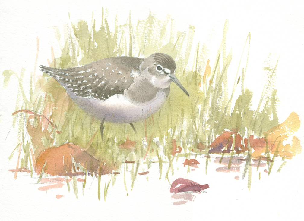
This is not always the case. Take a look at this watercolor done last spring at High Ledges in Shelburne (see On the Waterthrush Trail, May 21, 2015).
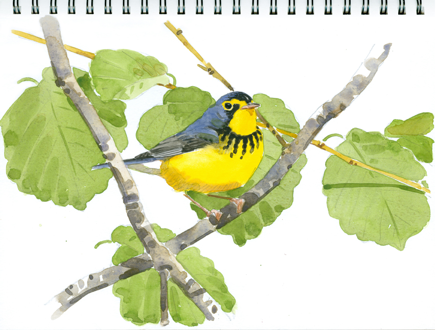
I always felt there was a problem with this painting – the negative shapes overwhelmed the subject and made the image visually confusing. The negative shapes were definitely working against me, here. Just recently I added a full background, with more witch-hazel leaves and stems, and a background tone.
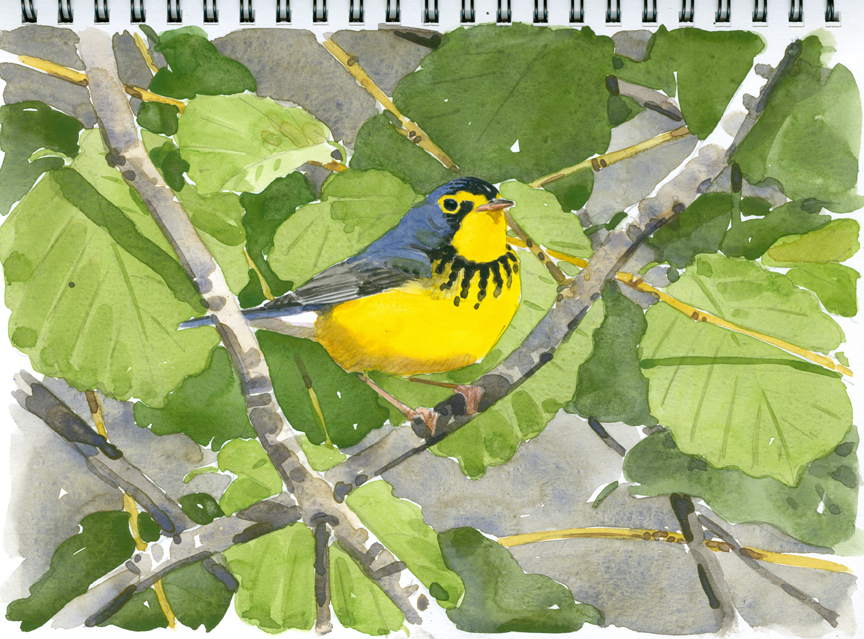
I like the painting much better now. The bird takes center stage, as it should, and that glowing yellow throat and belly have a lot more impact! I hope you like it better too, since there’s no going back!